About Color
I was looking for suitable color maps the other day when trying to squeeze too much data into a plot. Usually I prefer to just remove some details for the sake of clarity, but even then, color matters.
Procrastinating away the afternoon, I stumbled upon this super nice article on color palettes by Samantha Zhang. She gives a comprehensive overview of aspects to consider when picking colors, such as how to make your plots accessible to colorblind readers. Best of all, she provides a long list of resources, links and tools that help with the process.
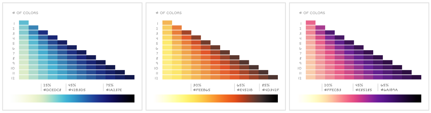
Since then, Samantha’s article became my go-to resource on color in data science, and I am currently testing out three of her color maps in a paper draft. Below you find a python snippet to mimic them in matplotlib.
import numpy as np
import matplotlib.pyplot as plt
from matplotlib.colors import LinearSegmentedColormap

custom_cmaps = dict()
custom_cmaps["cold"] = [
    (0, "white"),
    (0.25, "#DCEDC8"),
    (0.45, "#42B3D5"),
    (0.75, "#1A237E"),
    (1, "black"),
]
custom_cmaps["hot"] = [
    (0, "white"),
    (0.3, "#FEEB65"),
    (0.65, "#E4521B"),
    (0.85, "#4D342F"),
    (1, "black"),
]
custom_cmaps["pinks"] = [
    (0, "white"),
    (0.2, "#FFECB3"),
    (0.45, "#E85285"),
    (0.65, "#6A1B9A"),
    (1, "black"),
]

def cmap_for_mpl(colors, n_bins=512):
    return LinearSegmentedColormap.from_list("custom_cmap", colors, N=n_bins)

# for functions that use color map objects
cmap = cmap_for_mpl(custom_cmaps["pinks"])

# or to get discrete color values, call cmap() with a value between 0 and 1
num_lines = 5
for idx in range(num_lines):
    clr = cmap((idx + 1) / (num_lines + 1))
    x = np.arange(100)/np.pi
    plt.axis('off')
    plt.plot(x, np.sin(x + idx*np.pi/4) + idx, label=idx, color=clr)